NEW CURRENT STUDIO / HONG KONG
Constant Care
A fresh direction for everyday laundry care.
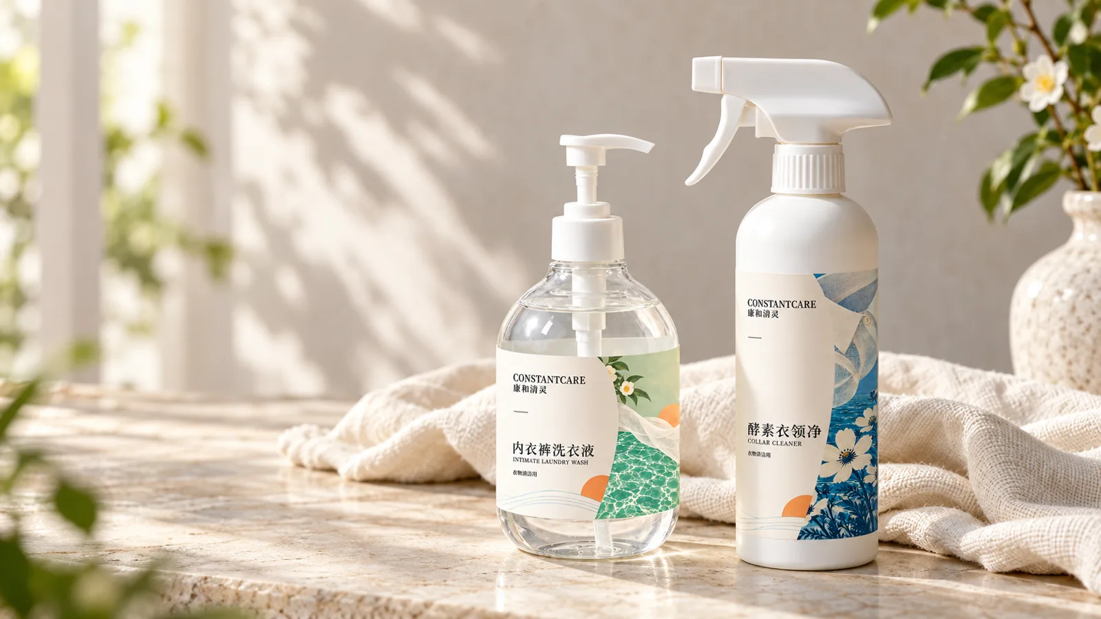
Different products.
One visual family.
The products used existing bottle shapes, so the design had to work within the space and proportions of a sticker label. The challenge was to give each bottle a modern, clean appearance, make its purpose easy to recognise, and connect different products into one cohesive visual family.
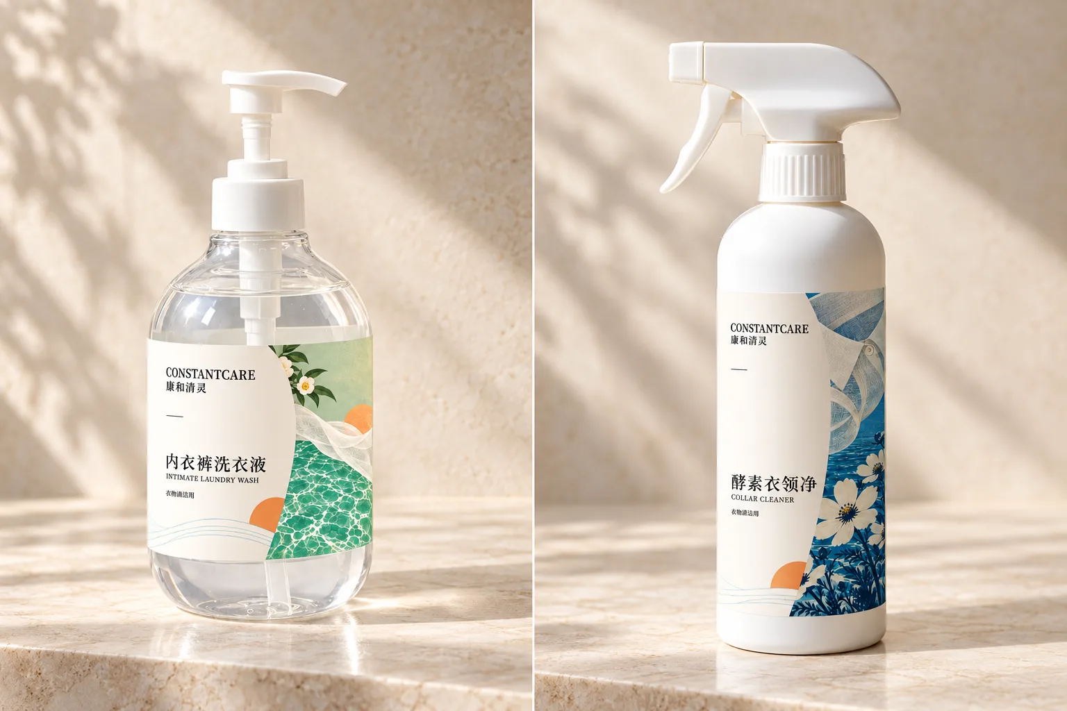
A shared language,
room to be distinct.
A shared layout and consistent typography give the range a recognisable structure. Chinese leads the information hierarchy, with smaller English text supporting it.
Distinct colours help customers tell the products apart. Related illustrations share a visual style while reflecting different laundry moments. Together, these choices give every product its own character while keeping the collection connected.
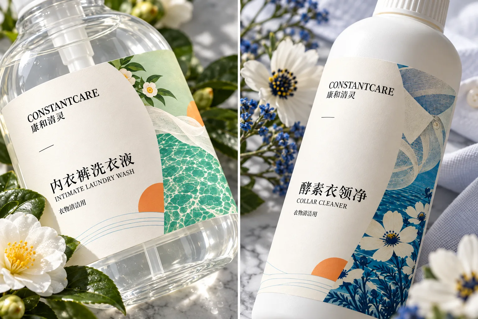
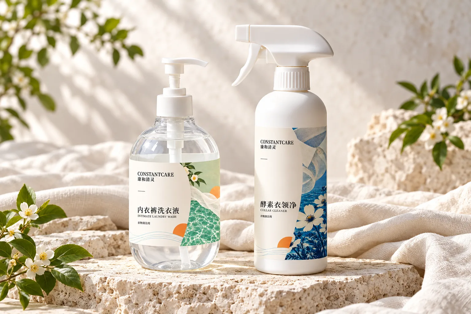
A bolder way
to tell them apart.
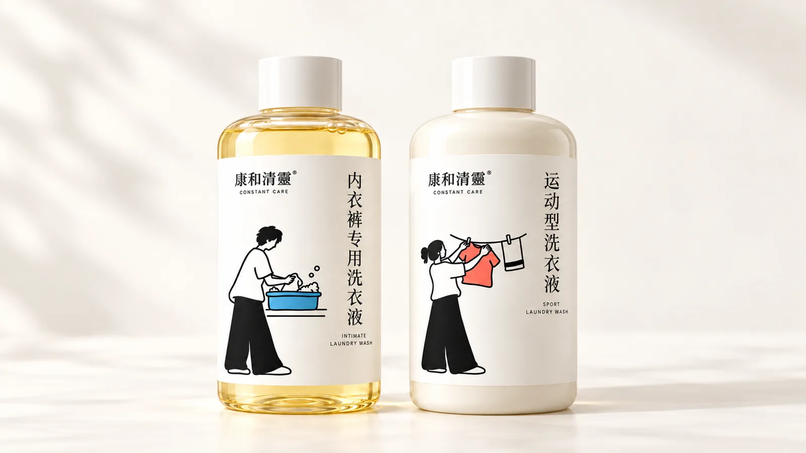
Alongside the botanical direction, we explored a more minimal, illustrated approach for two specialised laundry products: intimate wash and sports wash.
The challenge remained the same: design within the label space on existing bottles while making each product’s purpose easy to recognise. A shared layout and Chinese-led typography connect the range. Related line drawings show different laundry moments, while a blue basin and coral garment give each product a distinct accent.
04 / THE DESIGN THINKING
A shared structure.
Individual character.
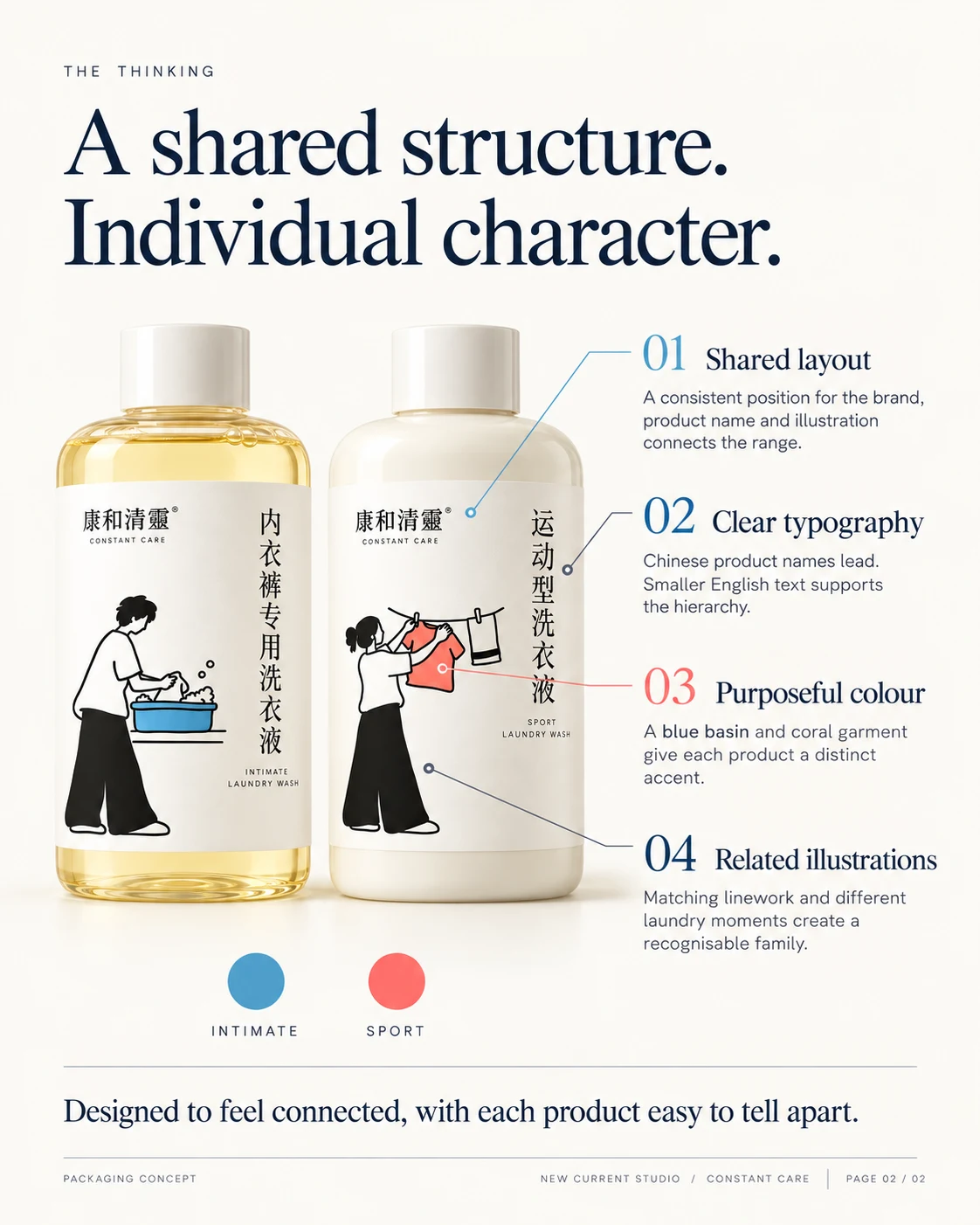
Shared layout
A consistent position for the brand, product name and illustration connects the range.
Clear typography
Chinese product names lead, with smaller English text supporting the hierarchy.
Purposeful colour
A blue basin and coral garment give each product a distinct accent.
Related illustrations
Matching linework and different laundry moments create a recognisable family.
Creative direction and packaging design by Leo Kun. These visuals present a design exploration; sales or performance outcomes have not been reported.
Explore packaging services