Hospitality · Environmental Graphics · Signage · Client project
HAIKU
Japanese shopfront references meet Melbourne cafe culture through timber signage, illustrated flags and playful print design.
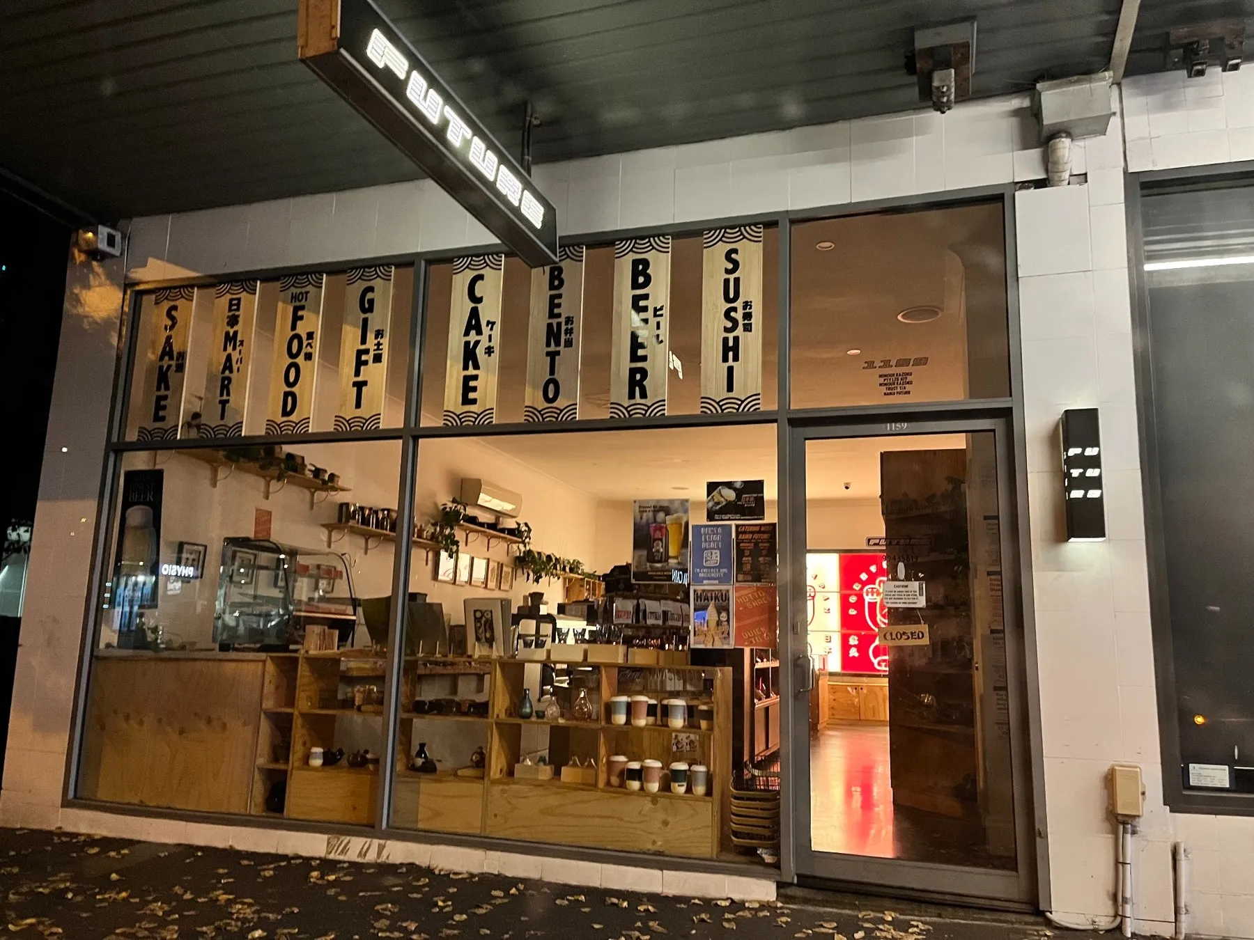
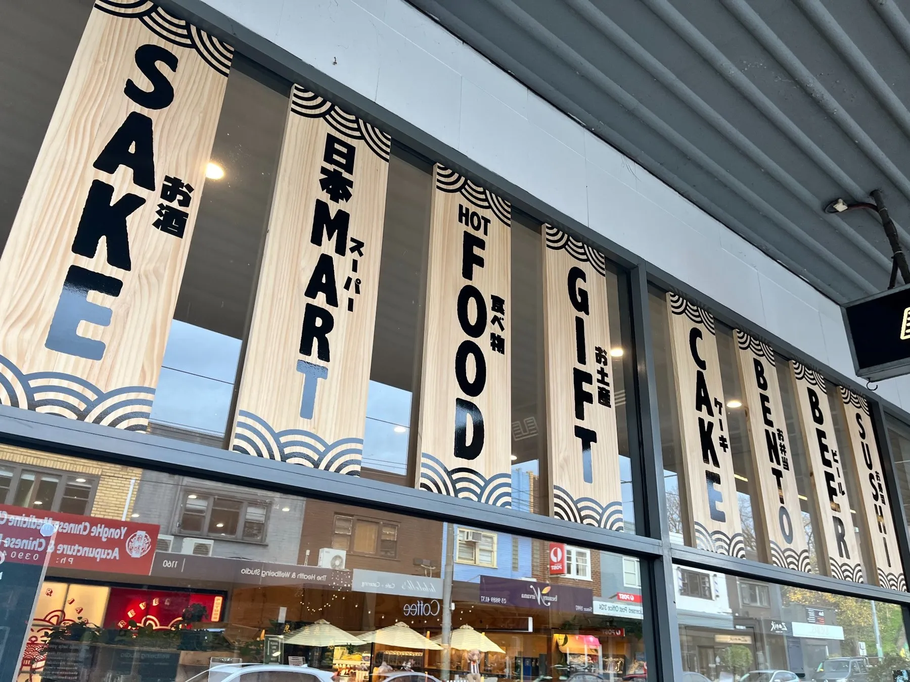
Japanese character. Melbourne spirit. A family of storefront graphics for Haiku, a Melbourne cafe with a cross-cultural approach to food and atmosphere.
THE CHALLENGE
With a Japanese-French owner and a mix of contemporary Japanese and Australian influences, Haiku needed exterior graphics that expressed its personality while clearly communicating what customers could find inside.
THE RESPONSE
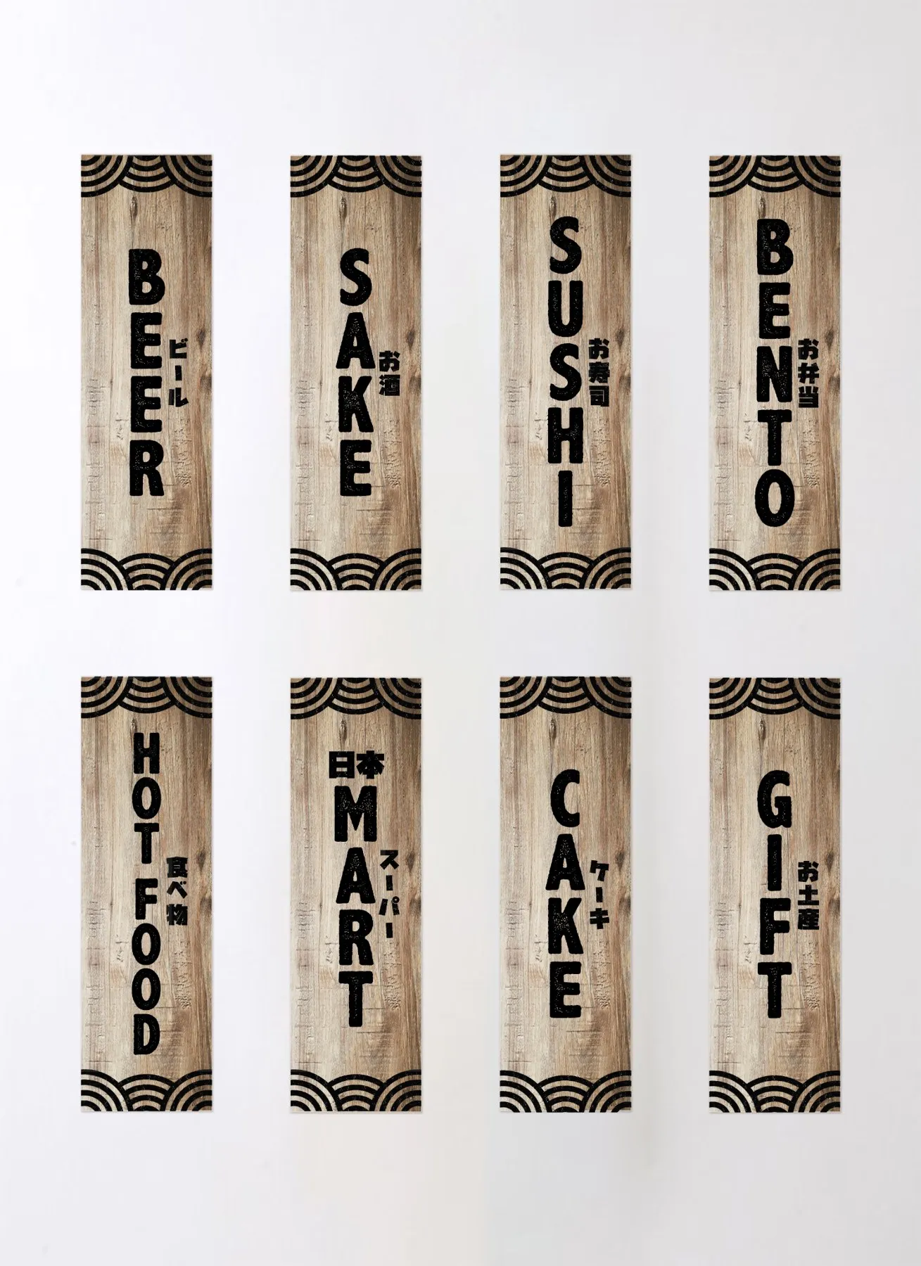
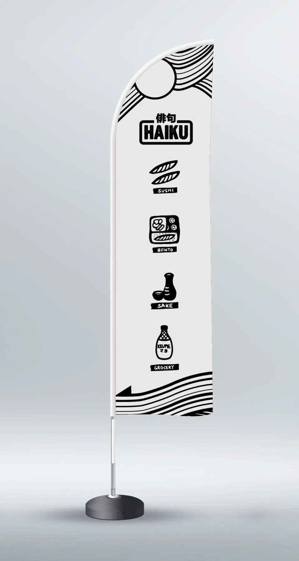
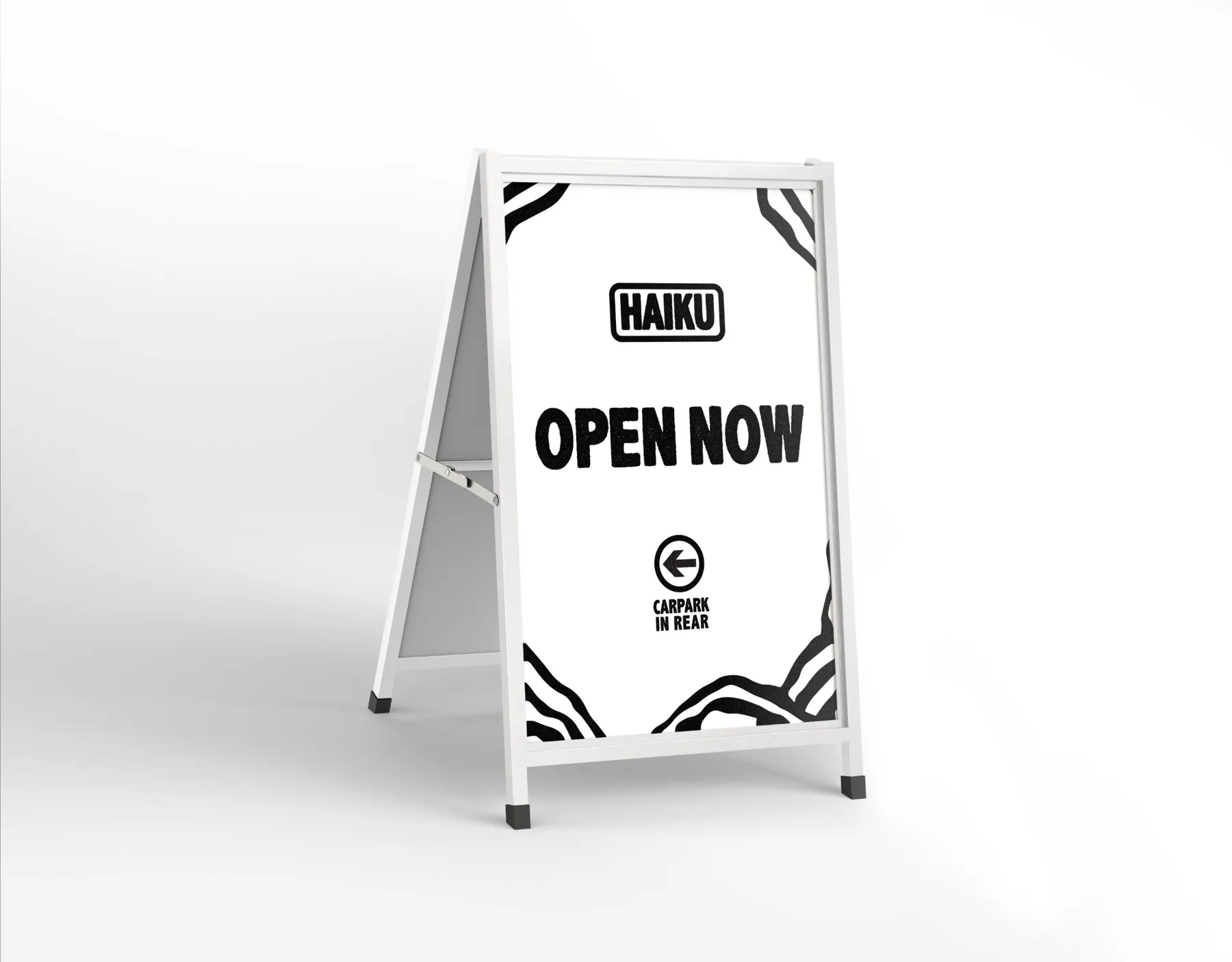
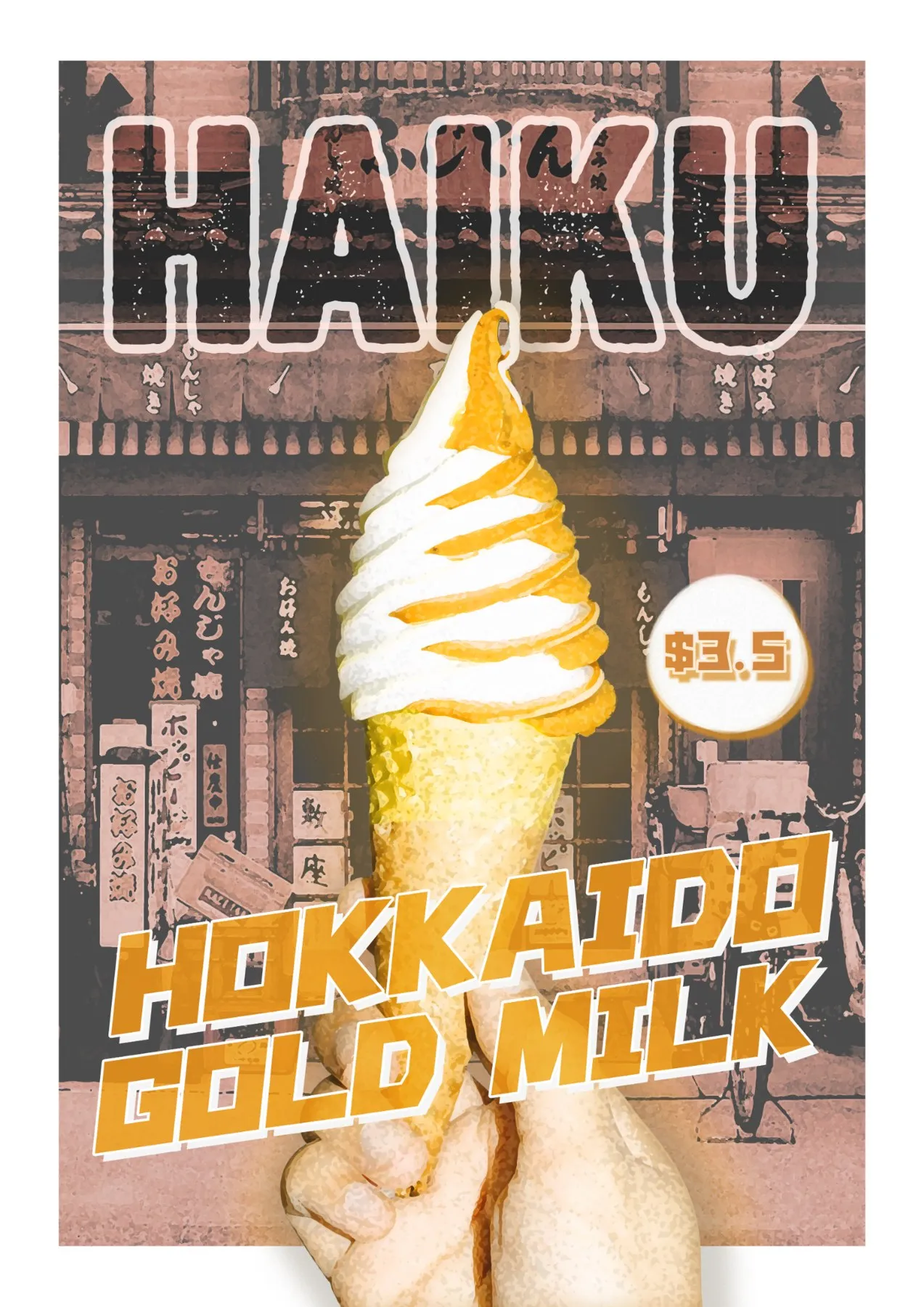
I created timber-panel graphics, an outdoor flag, an A-frame sign and a promotional poster. Vertical English and Japanese lettering, repeating wave patterns and simple food illustrations connect Japanese shopfront references with the relaxed character of a Melbourne cafe. The Hokkaido Gold Milk poster takes a more expressive direction through oversized typography, warm colours and layered imagery.